One Medical Brand
Our focus is on delivering exceptional primary care, so we’ve thoughtfully created a totally new kind of doctor’s office — one that’s truly designed with people at the center. It’s an experience that that actually fits into real life, not the other way around. To us, no detail is too small if it makes healthcare more efficient and less stressful.
To represent the breadth and depth of our care, our identity is comprised of several parts, resulting in a flexible and dynamic system. One Medical — our brand — is made visible through every word, image and gesture.

Visual Identity System
A brand is more than a logo. Our visual identity is made up of several key elements — color palettes, typography, illustration, photography — all of these elements help form a "visual ecosystem" for One Medical. The system’s flexibility allows us to express our vision, beliefs, and commitments in a way that is uniquely One Medical.

The Logo
The logo consists of three distinct elements — the atom, the brand wordmark, and the brand descriptor. Together, these elements form the primary graphic identifier for our brand. The atom represents the breadth of our network and surrounding care you receive at One Medical. It acts as a simple, bold icon to represent our considered, modern approach to healthcare.
Download our logo assets here.

The atom can be used independently of the brand wordmark and brand descriptor. Even isolated, it’s an iconic icon that distinctly represents the One Medical brand. Our logo system is flexible and allows for variation while maintaining clear and consistent brand recognition.

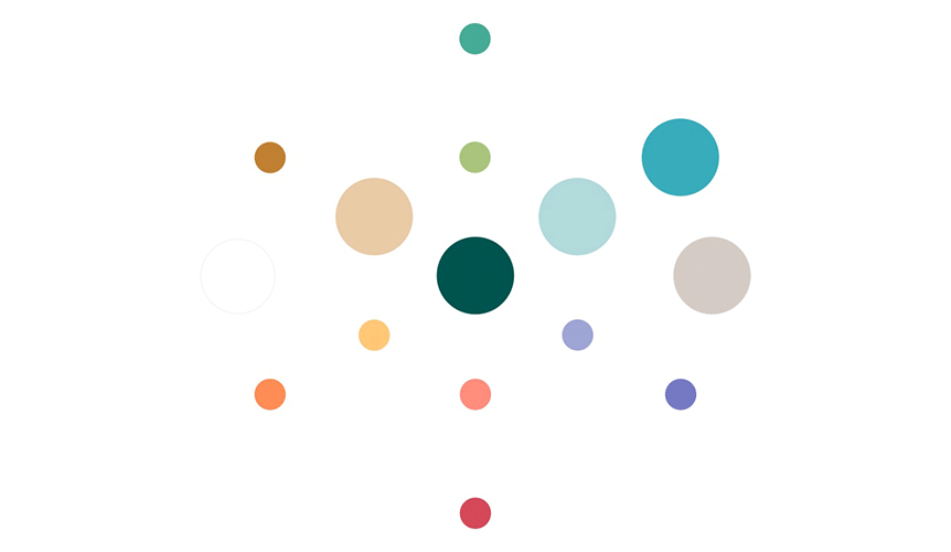
Color
Color is a powerful component of our visual identity system. Our color palette is designed to scale across a wide range of brand applications and reinforce our position as a premium healthcare brand. By limiting our brand to select primary and secondary colors, we can encourage recognition and memorability of the One Medical brand.
Typography
Our primary typefaces are One GT Super (serif) and Ginto (sans serif). We created a custom version of GT Super to work within our visual system. One GT Super has a balance of organic forms and precise serifs, which brings an approachable yet contemporary quality to our brand communications. Ginto is geometric-humanist typeface with circular forms that are reflected in the geometry of the One Medical atom.
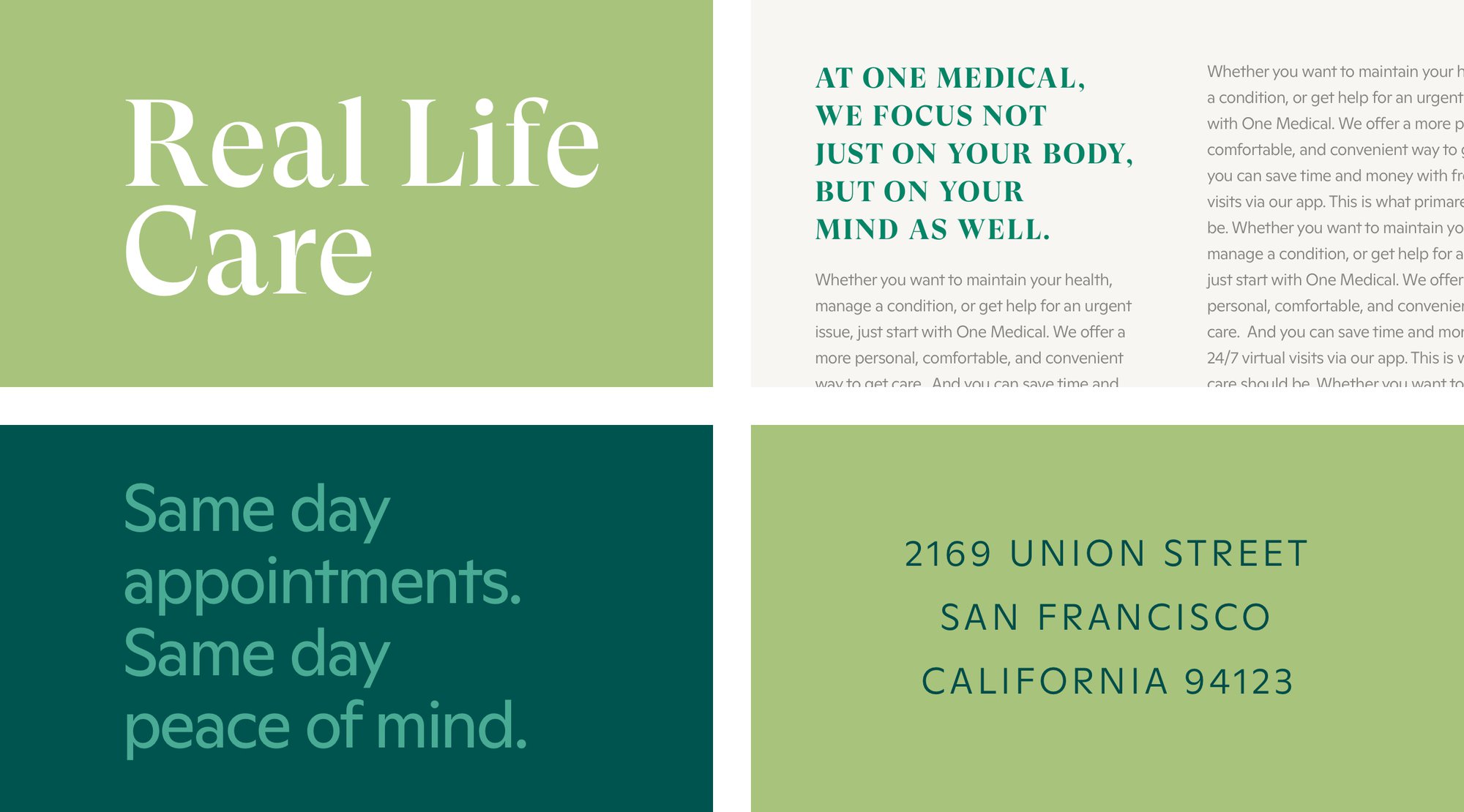
One GT Super is full of character, so it can work on its own as a headline, or be paired with Ginto as a part of the larger typographic system. Whether set in all-caps or sentence case, thin or thick weights, a wide range of styles can be created from our two typefaces.

Photography
Telling a story doesn’t require showing the entire picture. One Medical’s photography is not simply a representation of our offices, but a portrayal of our human-centered experience through intimate crops of people together. This abstract representation of care is a powerful catalyst for personal wellness.

Illustration
Our illustration has an editorial approach, providing flexibility, longevity, and a unique visual layer for storytelling. A human touch is always present in artwork to reflect the individuality and diversity of people as well as the attention and care given to patients. It’s rooted in reality, using natural colors, textures, organic shapes and lines. It’s free of an overt connection to a specific time period so that the focus is on what’s being communicated.

Every piece of the One Medical identity system — visually and editorially — has been carefully designed to work alone and together, creating a unique, recognizable brand. One Medical embodies real life care and deeply considers our people and their experiences. Everything we say, do, or make should express this idea.